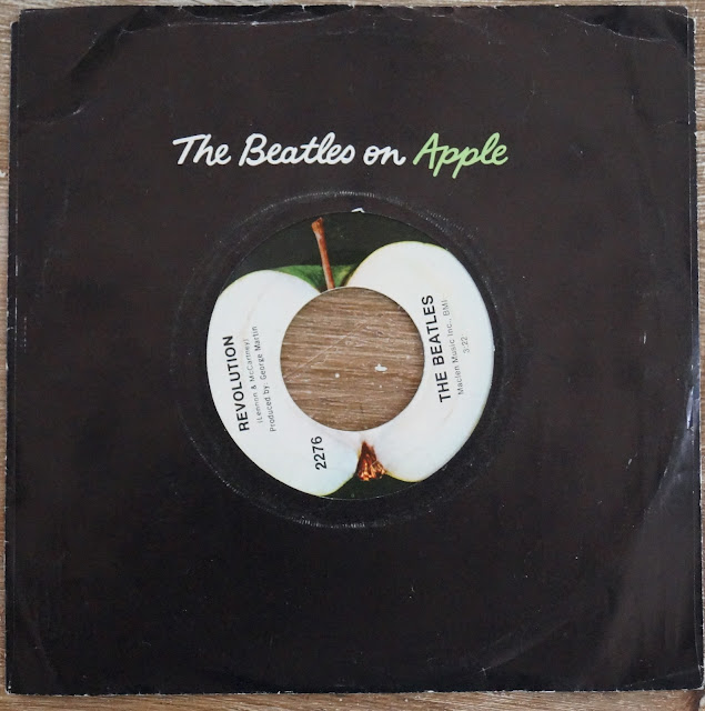
In 1968, The Beatles launched their own record company. The first release was this....
The Beatles - Hey Jude/Revolution (Apple 1968)
At the time, picture sleeves were usually just garish pictures of the bands. The Beatles were no exception. For Apple, they opted for a simple design in both the label and the sleeve.
A simple 'The Beatles on Apple' in cursive against a black background. Non Beatle releases simply said 'Apple.' The label was unique at the time as the name of the company is not shown anywhere. The photo of the apple said it all.
For the B-Side, Apple releases showed a cross section of the Apple. Unique at the time to have a pronounced difference between side 1 and side 2 in a standard record company label.
And as an aside, my pressing of this title is an original as evidenced by the tiny 'Capitol' logo at the bottom of the B-Side.
Revolution has never sounded better than the original mono cranked up to 11.
The Stores. The Chores. The Mainstream. The Oddball. The Serious. The Goofy. The Awesome. The Not So Awesome. 45's. 33's. The 'What Were They Thinking.' Stories from the Store. Observations from my armchair.
What's All This Then
Why should I care what this guy has to say?
The correct answer is that you shouldn’t. We’re all entitled to our opinions. Develop your own. I try to be sane and rational, but that may change with the level of caffeine intake. I’m just telling my stories in the hopes they may amuse and/or inform others. And... I Confess... I'm showing off my bitchen collection a bit.


No comments:
Post a Comment